Life Expectancy by Country

Life Expectancy by CountryI was inspired by Andrew Collier’s blog post Life Expectancy by Country where he illustrated how to create a bubble chart that compares female and male life expectancies for a number of countries based on the data scraped from Wikipedia using R and Plot.ly charts.

I decided to replicate these results using another popular language for technical computing – Julia.

Scraping Wikipedia in Julia proved to be less elegant, as it is missing a convenient package for ingesting tabular data from web pages into data frames, but otherwise it was a relatively simple task.

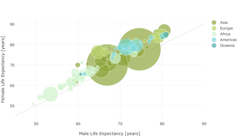
The dotted line in the chart corresponds to equal female and male life expectancy. The size of the bubbles is linearly proportional to country population.

Interactive plot is available on Plot.ly.

See the gist on github.


Comments

3 responses to “Life Expectancy by Country”

  1. […] Check out a similar analysis done using Julia. […]

  2. Any chance you’d release a small package for scarping data from webpages like this?

  3. I see you don’t monetize your website, don’t waste your traffic, you can earn extra cash every month because
    you’ve got hi quality content. If you want
    to know how to make extra money, search for: Mrdalekjd methods for $$$

Leave a Reply

Your email address will not be published. Required fields are marked *

This site uses Akismet to reduce spam. Learn how your comment data is processed.