

Tag: Data Science
-
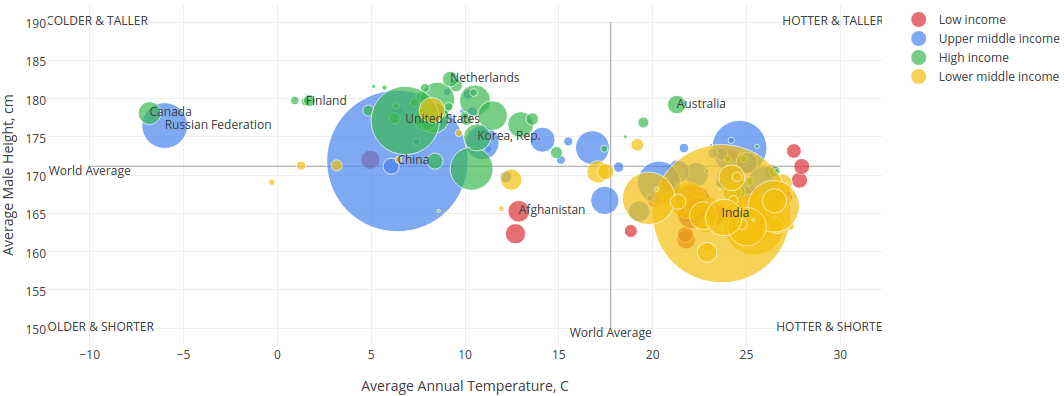
Are People in Colder Countries Taller? in Julia
Continuing to play with Julia and data visualizations. This time I decided to replicate a scatterplot created by Matt Stiles examining the relationship between a country’s average temperature and its male residents’ average height. Data comes from WorldBank and NCD-RisC. The size of the bubbles is linearly proportional to country population. Color indicates new World Bank income categories. People seem to…
-
Life Expectancy by Country
I was inspired by Andrew Collier’s blog post Life Expectancy by Country where he illustrated how to create a bubble chart that compares female and male life expectancies for a number of countries based on the data scraped from Wikipedia using R and Plot.ly charts. I decided to replicate these results using another popular language for technical computing – Julia. Scraping Wikipedia in…
